
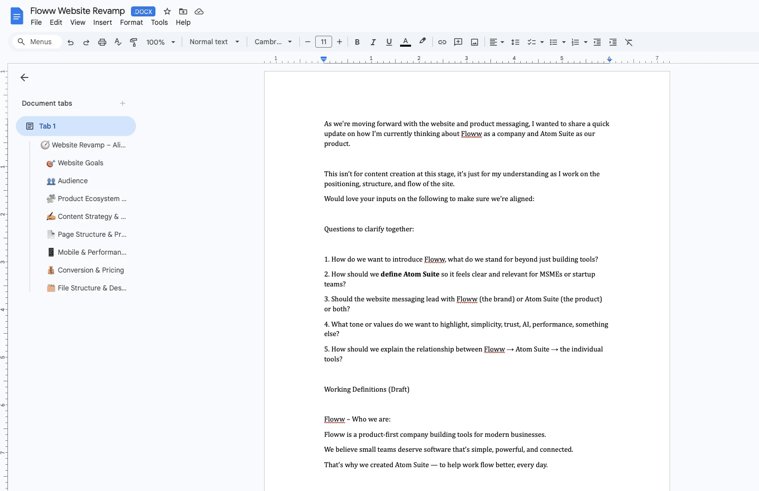
Mobile version is in progress.
Atom Suite Landing Page
Atom Suite is Floww’s ecosystem of business tools — designed to work independently, but stronger when connected. What began as a redesign became an exploration of how separate tools can work as one cohesive system.
Floww / Atom Suite
UX · Product · Interaction · Systems
SaaS Ecosystem · Multi-product Experience · Workflow Design
n | Branding
The Starting Point and the Shift
(Design Context):
What existed ✦ Why it no longer worked ✦ What needed rethinking
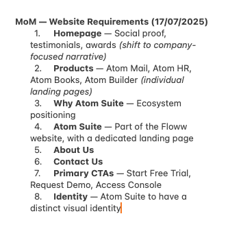
Before Moving Forward
Shared assumptions ✦ Open questions
gofloww.com → gofloww.com/atomsuite?
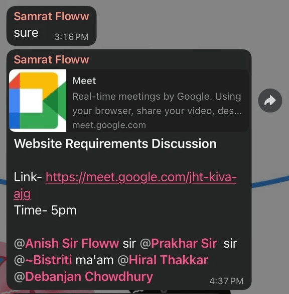
Touchpoint. It helped bring the PM, Marketing, and CEO onto the same page before moving forward.
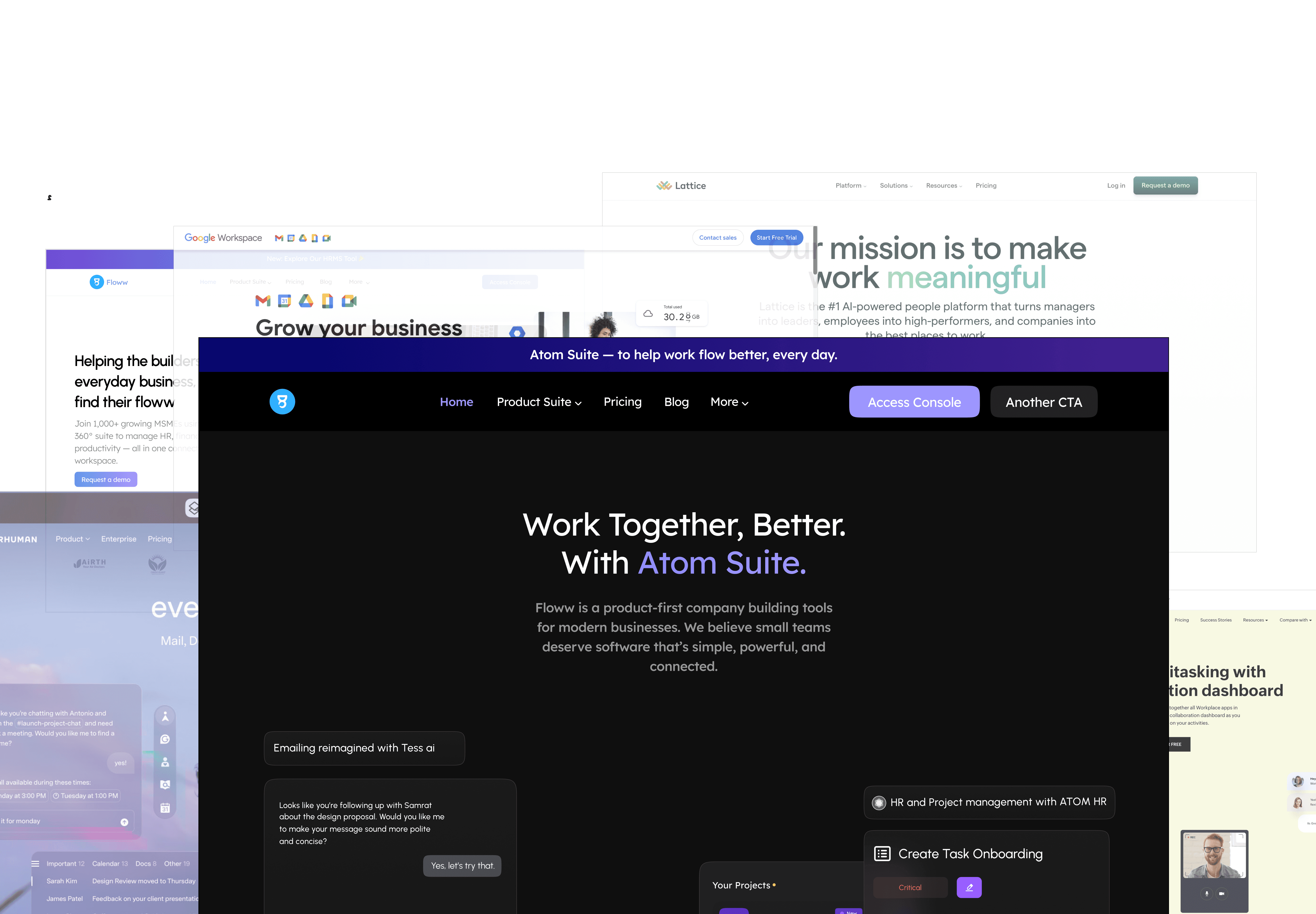
From Product to Platform: Finding Our Place
What exists ✦ Where we fit
Atom - Energy, depth, motion.
What exists ✦ Where we fit
Atom Suite — a product built like a universe. Expanding, connected, alive.
Atom Visual Language
The Atom visual language is designed to feel modern and cohesive, using a dark, high-contrast base with expressive gradients and subtle textures that reinforce depth and brand identity across screens.
Typography
Font
Regular/Medium/Semi Bold
Urbanist/Instrument Serif
Scalable
Highly legible
Versatile
Web / Mobile
Sub Heading:
44 - 48px / 20 - 24px
Sub Heading:
44 - 48px / 20 - 24px
Sub Heading:
44 - 48px / 20 - 24px
Urbanist handles structure. Instrument Serif adds character. Together they create a hierarchy that scans fast and reads clean.
Color
Role: Identity, mood, and visual depth
Hero gradients
Background textures and depth layers
Brand expression tied to the atomic / cosmic theme
Role: Structure, focus, and longevity
Primary page background
Section canvases
Overall visual foundation
Helps maintain consistency
Role: Interaction, and clarity
CTA
Icons, indicators
White text and neutral UI elements
Dark neutrals hold the foundation. Purple–blue tones do the expressive work — gradients, depth layers, brand moments — without taking over.
Accessibility
Contrast ratio: 18.42:1
Text color: #FFFFFF, #DAC8FE
Background color: #141414
Introducing Tess AI:
the intelligence behind
every Atom tool.
Contrast ratio: 18.42:1. Meets WCAG AA and AAA. High visibility on dark surfaces without breaking the visual balance.
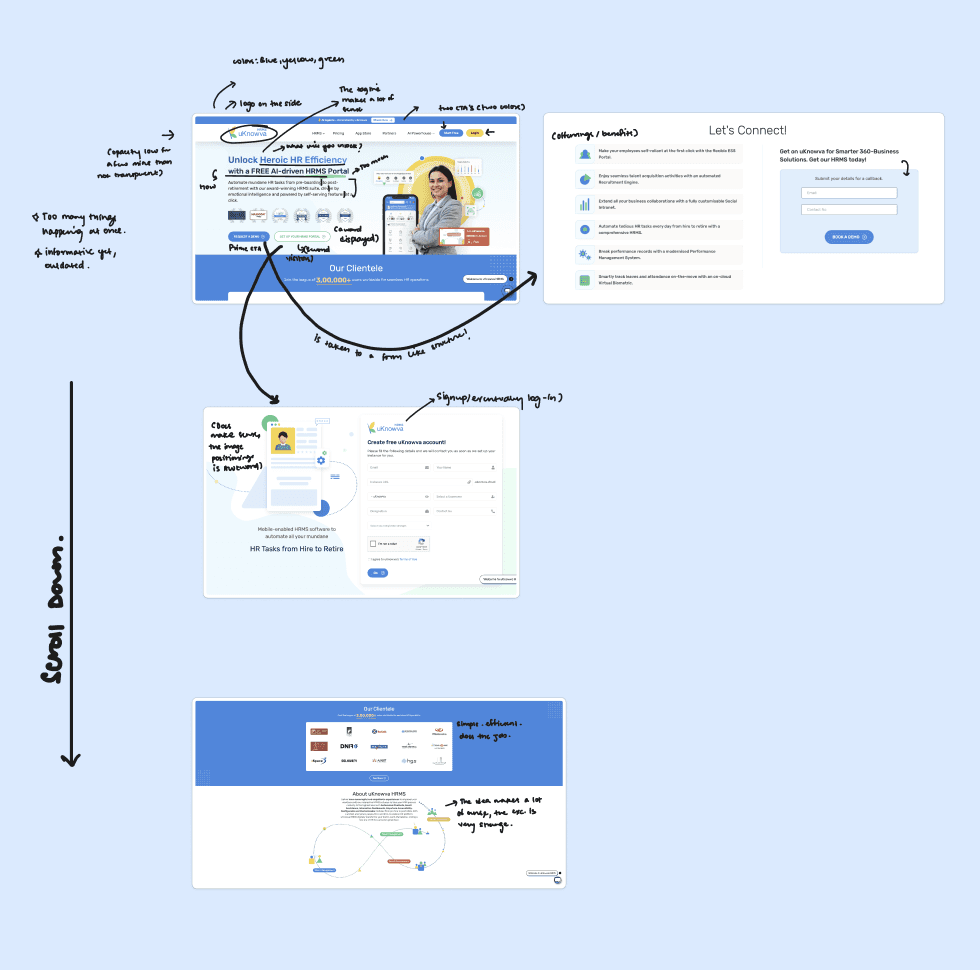
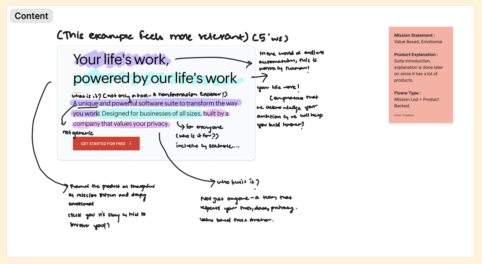
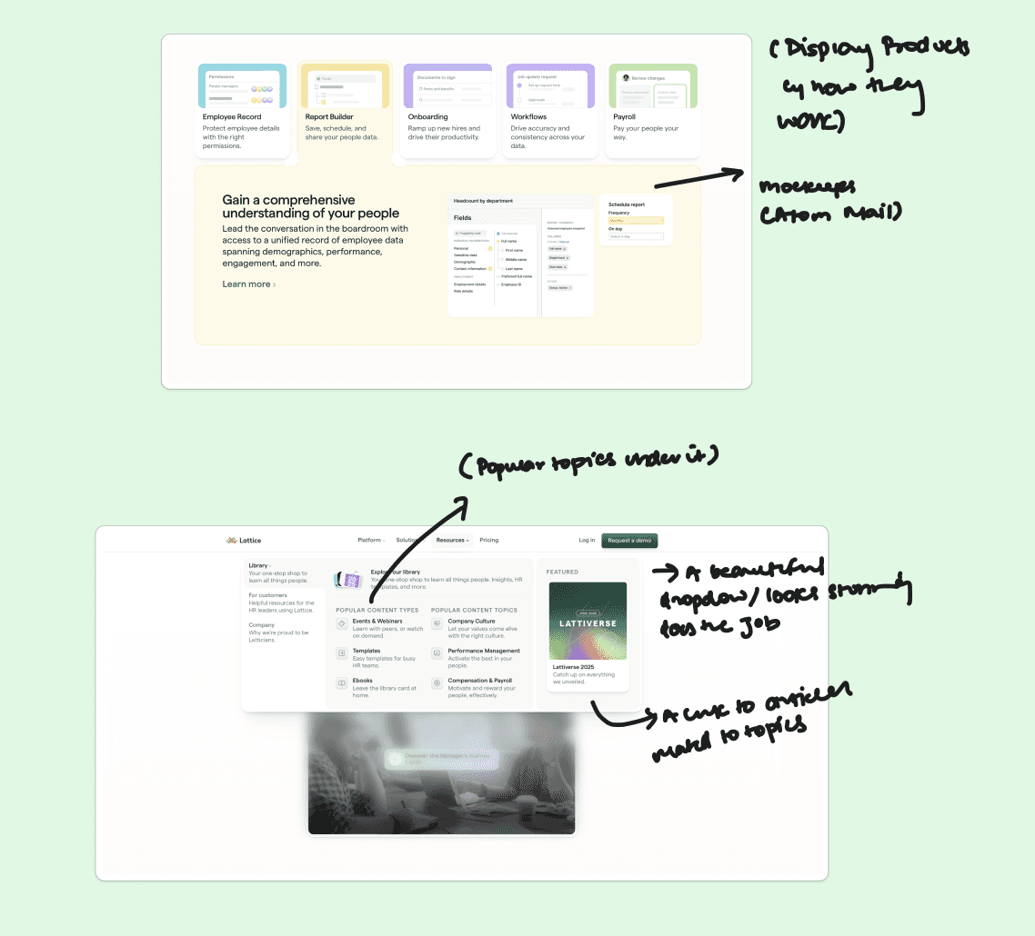
Written for small businesses — approachable tone, clear product details, no jargon. Structure lets users orient fast: who we are, what we offer, why it matters. Information-heavy sections are intentional, not accidental.
Surface & Depth
Siddharth Rao, HR Manager
CloudPeak Solutions
(4.9)
Attendance, leaves, and payroll used to overwhelm us. Atom HR gave us complete clarity and reduced manual effort across every department.
Read the success story →
Siddharth Rao, HR Manager
CloudPeak Solutions
(4.9)
Attendance, leaves, and payroll used to overwhelm us. Atom HR gave us complete clarity and reduced manual effort across every department.
Read the success story →
Reviews
Explore the Atom Library ; learn, build, and grow smarter.

Ashmita Dey
5 min Read
The Atom Community: Builders, Thinkers, and Teams Redefining Everyday Work.
Read the blog
News/Blog
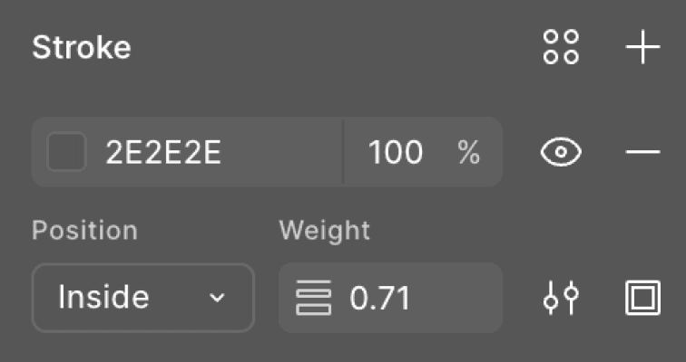
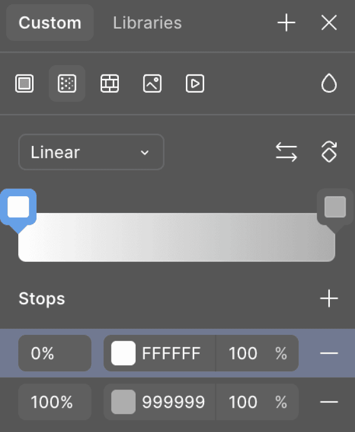
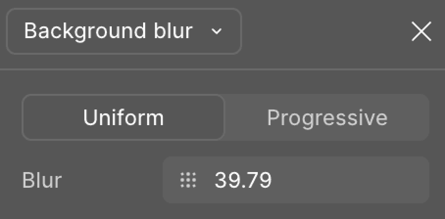
Noise, linear gradients, and background blur keep the UI grounded on dark surfaces. Thin strokes create separation without breaking continuity. Gradients fill space and guide attention — used sparingly so they don't compete with content.
Motion and Spacing

Slow star-like drifts, gentle fades, controlled transitions — motion reinforces the Atom identity without pulling focus. Generous vertical spacing gives each section room to breathe while keeping the page connected.
Where Atom Landed
What exists ✦ Where we fit